Thursday, October 14, 2010

Class Exercise

This is what i have to do in my class (to fill the spare time i think...no need to be cocky)

Humpty Dumpty story that we can only make it from random character below the boxes.
1) This is the Black and White version

2) This is the Colour version


Road Signs (that not so ordinary road signs)
I made it in funny way :)


*just click on the picture you'll get a big big bigger picture :D cheerssss

OLA!!!

Hi all I'm back :)
after went back from a holiday which i didn't touch or communicate with all of my assignment at all (I feel alive!! haha), I finally kind of miss this blog and decide to fill it up again. Off course you'll still see my project hehe and hope you all still like it!
SOOOOOOOOO HERE I AM :D

Wednesday, June 9, 2010

POP ART!! postcards

Enough about alphabet guys, time to move onnnnnnn...........................
On Design Culture and Theory subject we were asked to choose one art movement from the 20th century then produce 5 postcards to show that 20th century design is still influence contemporary design. By showing the 'Then' and 'Now' visual example in the front of the card and some critical thinking writing on how 20th century design influences the contemporary design in the back of the card.
My movement is POP ART! Because, i think pop art is really fun it's bright, colorful, playful and not boring at all! It's about YOUTH culture! :D

And this is what i've done


Tuesday, June 1, 2010

'love being children' the new one

I changed the appearance of my poster because the last one i think it didn't really show the alphabet that i already made
so, here it is the new poster

love being children

Finally it's done folks :)
I named my own alphabet 'love being children'.
Why i named it that way because i designed my alphabet in the way that i like the most, and why not put something that i like the most too as it title?! Then i just now that i love my childhood and i would like to become a child one more time :) besides my alphabet is really childish right?!
So, here it is my alphabet and my poster, hope you like it.

'love being children' by Wemona Narantaka

big caps


small caps


the poster :)

i go crazy over CALIBRI

Well, after i made my own alphabet i just realize that i actually like Calibri font.
In every assessment of writing that i got, I always use Calibri than Time New Roman.
I see Calibri as a typeface that not really in formal form but also not really casual either. I can use it in both casual or formal task.

Friday, May 28, 2010

Small Caps letters

I changed the whole small caps letters shape (not the whole entire letters actually) to follow the line of the "c" letter to keep it all in one style and i also changed the "t" but i'm not sure about it.. my teacher and my classmate said that it better that way

Big Caps letters

Okay here it is the final illustration of Big Caps letters i have made

Monday, May 24, 2010

Step 3 the big caps

The BIG caps guys :)


and the same problem happens (always)

the 'G'.... why oh why....


I actually already happy with the result that i use the right one G but i'm just not sure about that, is it following the style of the others letter too or not and i show you the other option that i have

Step 3 the small caps

After asking about 50 people, this is pretty much what i've came up with,
the small caps letter :)


I'm still not sure about the 'g'


The left one for the half round part i'm following the shape of the 'c' while for the right one for the half round part i'm following the other letters such as the 'p' , 'b' , 'd'
So, what do you think??

Friday, May 21, 2010

Still the Step 3

Hi, it's me again :)
After i show you the alphabet i make which is all in big caps, now i've made the small caps too :)
Actually my teacher said we don't have to make it but, he said to me that i should make both the big and small caps because he wants to see it and he finds it kind of interesting (i felt sooo happy when he said all those good things to me, it's important you know!!!!) :)
So, here it is the small little letters


and the same problem happens again guys.....
the letters that make me confused -_-"


I know it's all look similar and that's why i get confused.....
please please help me guys... help me decide okay?! :) thannxxxx again

Step 3

Now it is time to make our own alphabet! Which is kind of interesting but also hard in the same time i guess :)
Well, i want to make something different and came up with this idea, that i will make my letters line not touching each other's...
I already make some of the letters, here it is


actually i'm a bit confused with some letters
such as
the J


the G


the W


the S


(a lot of work and seeing and picking haha)

It's kind of confusing you know, when you make all of those letters and you feel all of it will work on each other but, you only can choose one (sadly)
i show it to my teacher in class and he said it's all okay (thanx Nigel) and i don't have to make all of the letters from A to Z (thank GOD) but, it feels not right you know, like your work is not done (i'm not trying being cocky but, it just the way i feel guys... yeah maybe if it's not work i will take off some of the letters)

Well... i hope you guys can help me decide when you all see it :) thanxxxxxx

Tuesday, May 11, 2010

Step 2

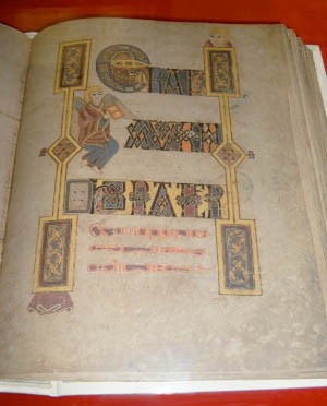
Illuminated manuscript letter

Illuminated is a very decorative letter and most recognized to be used on the Book of Kells.
It was created by Celtic monks ca. 800 or slightly earlier and written on a vellum (some kind of animal skin).
The manuscript takes its name from the Abbey of Kells that was its home for centuries.


It uses a lot of picture like face, bird, all about decoration and details.


The next thing we know our teacher asked us to make the manuscript letter, we also can make the new one.
So, here it is my own manuscript illuminated letter, my nickname M.
I kind of mixed up between the face and the bird because my teacher said it's interesting :D


that is the final sketch until i put dots around the letter following the style of the manuscript letter


more specific look :)

the face


the bird


and the letter


That's all :) hope you all find something interesting guys

Step 1

TRAJAN typeface!!

First task that we all must do is to trace our name in Trajan typeface.
Trajan is a typeface from Rome and known as one of the oldest typeface. It was named Trajan, following the Roman Emperor Marcus Ulpius Nerva Traianus, commonly known as Trajan who was ruled at the time where letters start to be used as a way of communication (AD 98 - ad 117).


In 1989 Carol Twombly was the first to do translation of the Trajan into type for Adobe.


So, after got all the information about Trajan typeface from my teacher then i start to make the tracing at school

(yep, that's me -_-')

anddddd here it is :)


what do you think??? :)


I think it's interesting because we get to know more about the old style typeface and how to do it which is kinda hard because we have to really really look for the detail when we trace it.
Imagine how they do it on a stone guys......